Colour in the interior is not just “like / don’t like”. It is a tool that controls mood, space and even how large a room feels.
The colour wheel — the basis for harmony
The designer’s main tool is Itten’s colour wheel. It helps find harmonious combinations:
- Complementary (opposite) — red + green, blue + orange. Such pairs give a vivid contrast and energy.
- Analogous (adjacent) — yellow + yellow-green + green. A soft, calm combination.
- Triad — three colours at equal intervals (for example, blue + red + yellow). A balance of contrast and harmony.
Neutral colours as the base
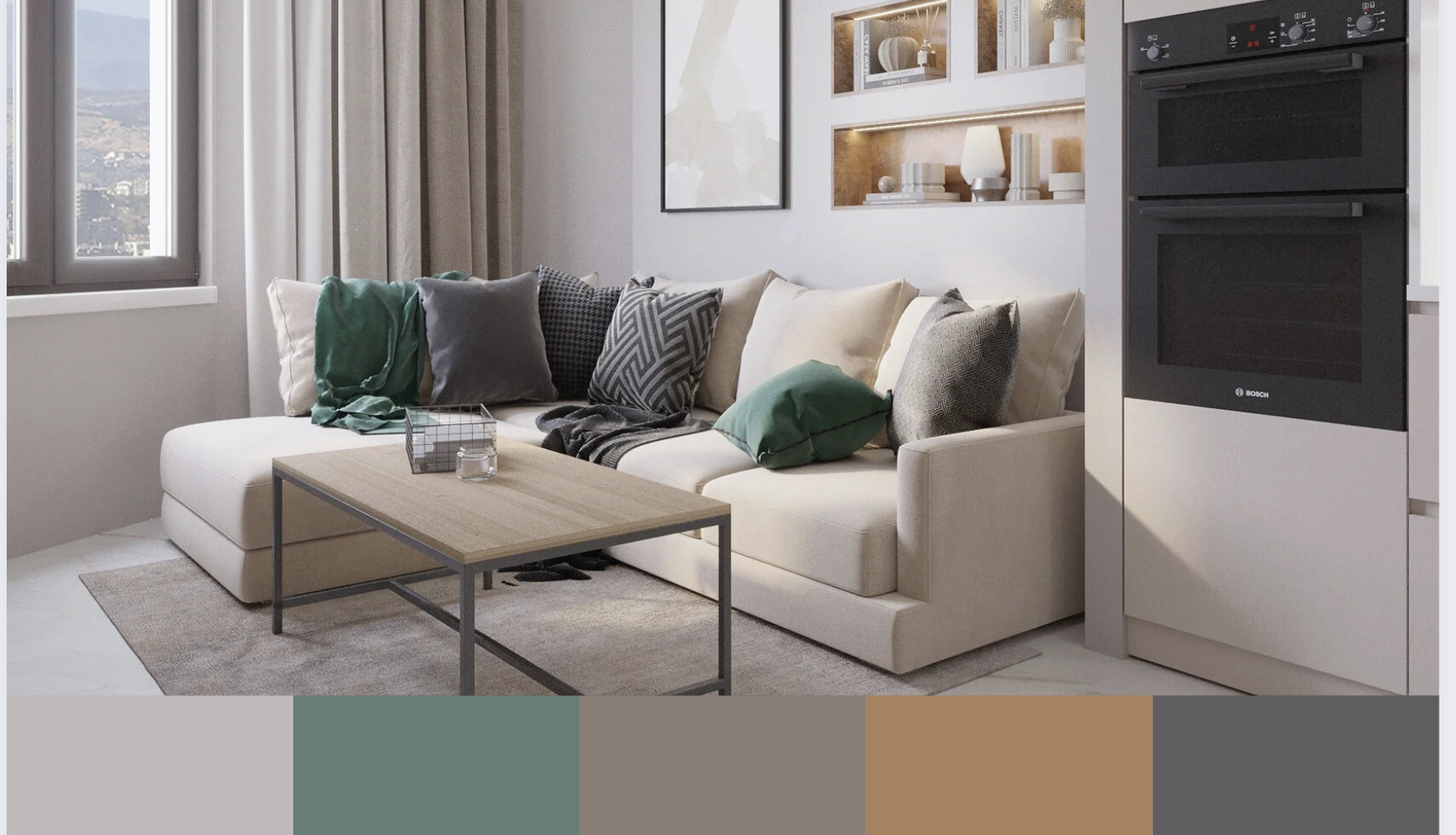
White, grey, beige, graphite — this is the “canvas” on which the interior is built.
- Neutral shades expand the space.
- They let you confidently bring in accent details (cushions, pictures, armchairs).
Accents and balance
An interior without accents feels “unfinished”.
- For a calm background we choose 1–2 bright colours.
- The 60/30/10 rule works:
- 60% — the main colour,
- 30% — the secondary colour,
- 10% — the accent.
Light and space
Colour doesn’t exist without lighting:
- Warm light makes shades softer and cosier.
- Cool light makes them cleaner and stricter.
- In small rooms it is better to avoid very dark tones on large surfaces.
Practical tips from our projects
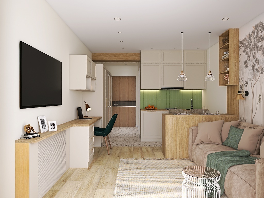
- A small kitchen: a light base + a bright splashback = a sense of space and individuality.
- A living room with panoramic windows: neutral walls + a contrasting sofa — to keep the attention inside.
- Bedroom: analogous pastel tones create a restful atmosphere.